


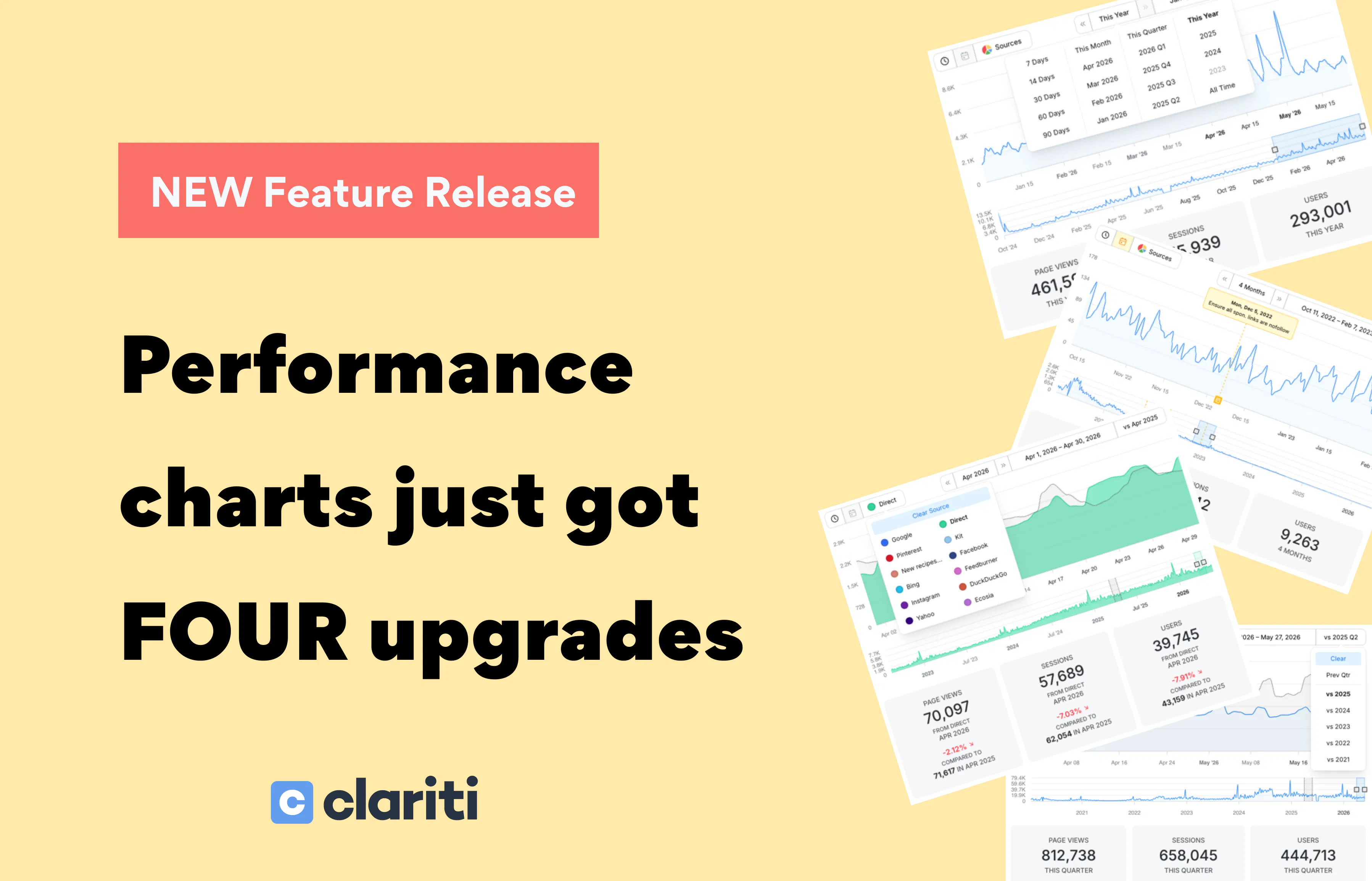
Your performance charts just got a big upgrade. Four of them, actually.
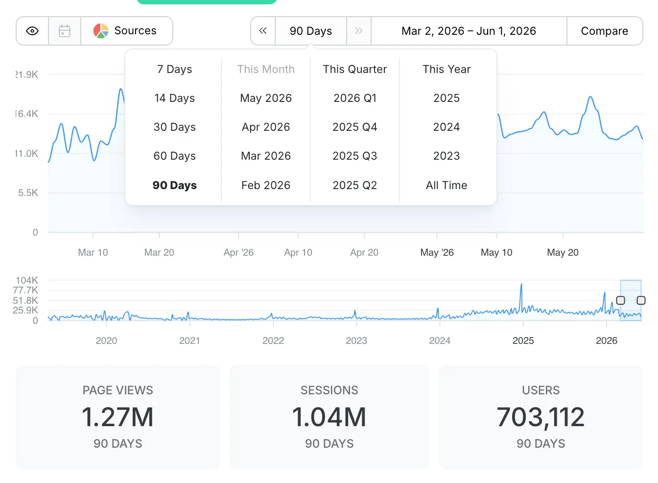
One-click time periods. Jump straight to Rolling 30/60/90 days, or shortcuts like This Month, This Quarter, and This Year. You can also pull up any past quarter or full year back to when your data begins.
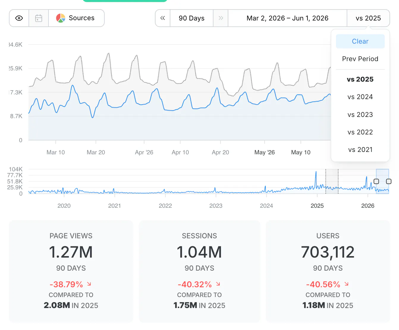
Comparison lines. Pick a time period, then add a comparison for the Previous Period or any past year. It draws right on the chart and updates the Statistics Cards below with totals and percent change, so you can see the trend and the numbers together.
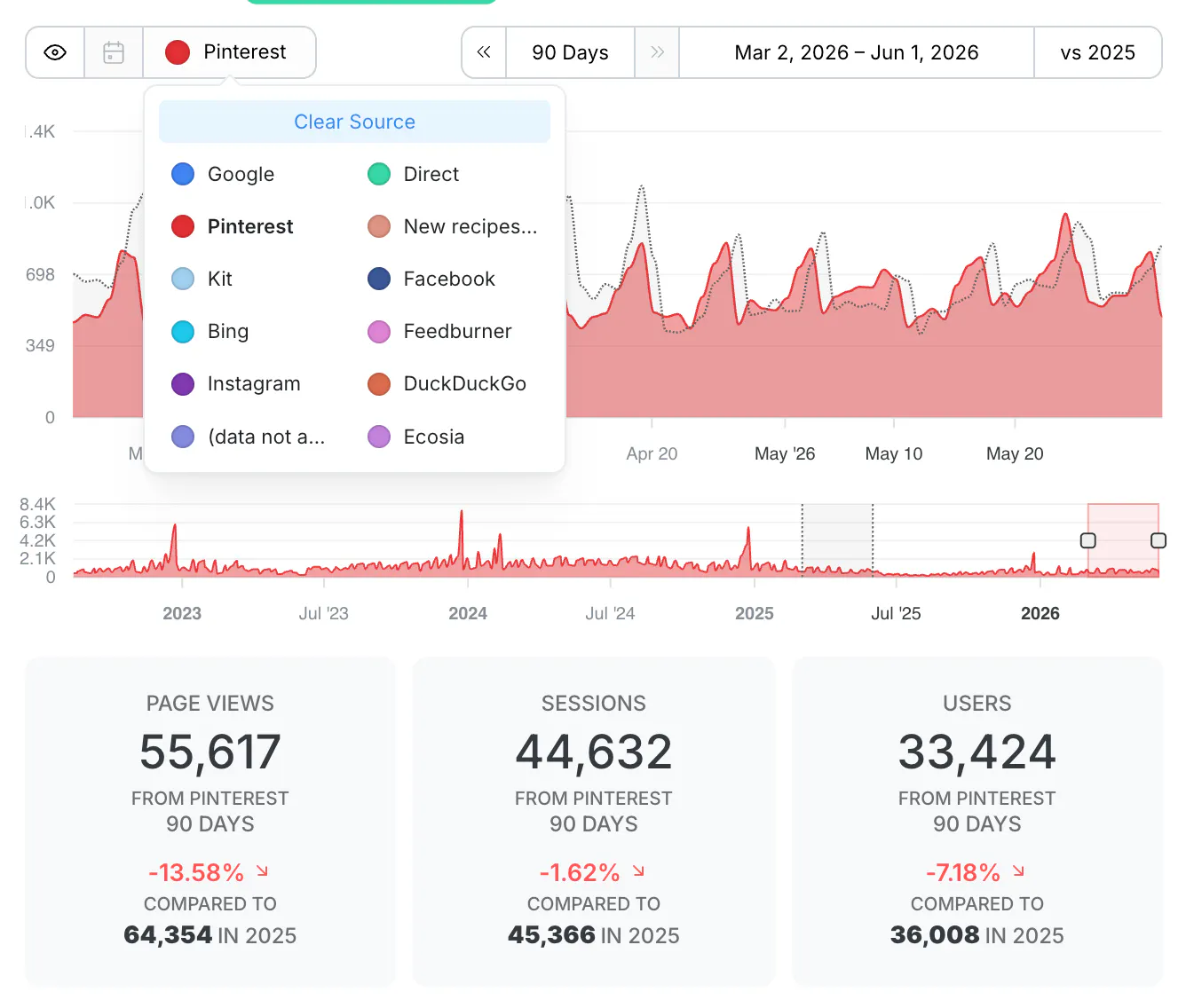
Traffic source charting. Open the source selector and plot a single channel over time: Google, Pinterest, Direct, your email provider, and more. It works with comparisons too, so you can chart a source against the same source a year ago and see exactly when it moved.
Refreshed annotations. The notes you drop on your charts are now easier to find, select, and read, and you can toggle them on and off with the new Toggle Events button next to the source selector. Annotations are live on the Content Detail View now, with sitewide annotations on the Home Dashboard coming soon.
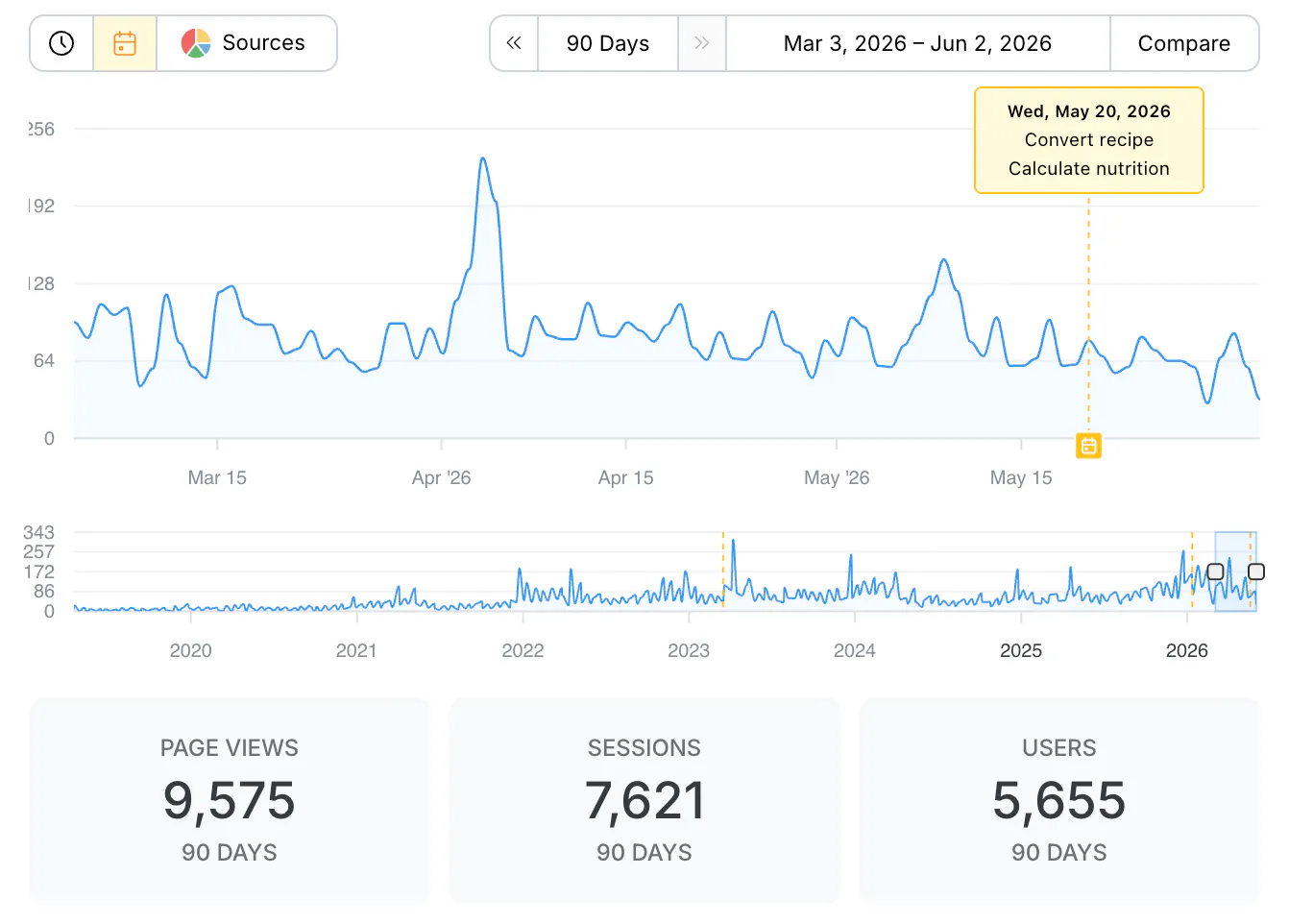
Time periods, comparisons, and source charting are live on both the Home Dashboard and Content Detail View today. Go set This Year against last year, pick a source, and see how you are tracking.
Full details are in the blog post: https://clariti.com/blog/whats-new-june-2026/
Let us know what you find.